
Fill your slip cordon? Put in a close ring in front of the bat? Whack some sweepers out on the ropes to contain the boundaries? At this point I may have lost a few readers who aren’t bothered by cricket and even less bothered by the current Ashes series going on. But having seen the events unfold at Edgbaston over recent weeks, it (yes rather tenuously perhaps) had parallels with how investors and asset allocators are looking to respond to the current market environment. It seems a case can be made whether you’re a bull or a bear and thus any ‘field’ you wish place can be equally justified within portfolios. But why are there so many conflicting indicators and what can investors truly rely on to guide them through?
Let’s take a step back. In the year to date, bond and equity markets are up. Headline inflation is falling in the US, the impacts of geopolitics have perhaps subsided for the time being and other indicators such as the VIX are at all time lows. On the other hand, PMIs in many places are contracting, savings piles are being depleted and the costs of financing are going through the roof (let’s not even get started on mortgage payments and the subsequent hit to house prices if you pardon the pun). There are so many indicators that it’s sometimes hard to know where to start and different views in different regions will spark a different response. So do you go long equities? Long bonds? Short equities? Short bonds? Stick with a 60/40 blend? Well with such uncertainty, many will say that the confusion alone points to a structural weakness being overlooked – particularly when you have powerful trends such as AI taking off simultaneously. Cutting through the noise and understanding what actually is likely to unfold is clearly everyone’s objective particularly given there are no crystal balls around. So what can investors hang their hat on and what should we be focussing on? Well there are two indicators (one market based and one real economy based) that I think are particularly prevalent and perhaps have the most gusto when trying to explain whether we are entering a ‘goldilocks’ scenario or whether we’re only just entering the real period of pain. Spoiler – both don’t paint a rosy picture.
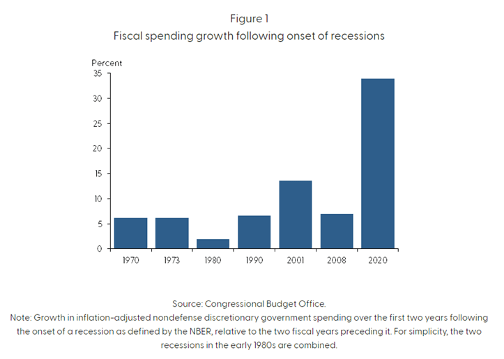
The UK is clearly in quite a pickle with inflation not budging so it is likely that recessionary impacts will be felt more here as a result of subsequent central bank action then in other developed parts of the world. However, if we zoom out and look at the US as a guide, a good place to start is savings. Why? Well talk of economic health of late (i.e. last 2-3 years) has all been centred around consumer and corporate purchasing power by virtue of high inflation and subsequently high interest rates. One way of masking these impacts is by digging into savings piles and so it seems an apt indicator to monitor if we are to make better sense of how the economy is going to behave once people are effectively more skint. Fiscal stimulus across the globe has meant that the consumer has been cushioned against the real impacts of supply chain disruption and rising costs of living. But how deep is this magical pot everyone talks about? Well pretty deep as it turns out but the pockets of the consumer aren’t as deep as they once were (even if we ignore the relative impacts of rising costs of financing). The first way to paint this picture is to start by looking at where these savings have come from and the degree of fiscal impulse in the US during COVID was, as we know, quite staggering:
Since the initial boost of fiscal stimulus during the pandemic vs the pre-pandemic trajectory, the decline in household savings was gradual, with an average monthly decrease of $34 billion from September to December 2021. However, the pace of drawdowns then increased, with an average monthly decrease of around $100 billion throughout 2022. In the first quarter of 2023, the drawdown rate slightly moderated to $85 billion per month. As of March 2023, the cumulative drawdowns amounted to $1.6 trillion, represented by the red area in the below chart, suggesting that there are still approximately $500 billion of surplus savings remaining in the overall economy.
However, if the recent rate of drawdowns continues, based on the average rates observed over the past 3, 6, or 12 months, it is likely that the excess savings will continue to support household spending at least until the fourth quarter of 2023. Perhaps inline with a lot of economic predictions.
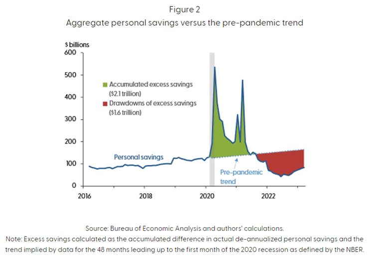
So with savings decreasing, overall purchasing power falling and interest rates increasing or remaining high, it’s clear in some ways that when that £500bn runs out (particularly given the already sky high level of government borrowing), central bankers will have fewer levers left to pull.
The bulls amongst us could argue though that this savings run-off time is enough for inflation in the US to moderate further whilst unemployment remains low and thus the heralded soft landing is achieved.
Well maybe, but I think that’s unlikely and I don’t think it can form a real base case from here purely based on many things have to come together at the right time for that play out. So if savings won’t convince you, then the real slam dunk in my view is to focus on the yield curve. This isn’t rocket science, most people do this when trying to decipher the overall health of markets/economies but I don’t see it written about as much as I would have thought if it is as powerful as they say it is. Oh, and if you haven’t visited it recently, the extent of the inversion may alarm you.
A recent FT article observed that looking over the past 40 years, yield curve inversions have predicted 100% of recessions. Now don’t get caught up with correlation vs causation but instead focus on this as a pretty accurate leading indicator.
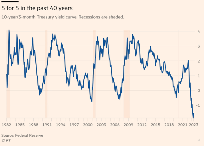
At this point, it’s fair to question my reliance on the yield curve irrespective of its incredibly strong predictive powers and the reasons for this are quite multifaceted. Firstly, current monetary policy has a significant influence on the yield curve spread and hence on real activity over the next several quarters (i.e. monetary policy impacting short-end yields). A rise in the short rate would tend to flatten the yield curve as well as slow real growth in the near term. Although this relationship is very likely part of the story, it is not the whole story. Expectations of future inflation and real interest rates contained in the yield curve spread seem to play an important additional role in the prediction of future activity (i.e. overall economic health impacting long end yields). The term structure of rates therefore allows investors to capture not only both short & long term market expectations but also macro variables such as interest rates and inflation movements. To make things even simpler, the bond market is more closely akin to the price action of sovereign yields given the fixed nature of bonds (as opposed to equities where there is more subjectivity involved in the pricing) so this factor combined with my prior points make for quite a nice ‘one-stop-shop’ for cutting through the macro noise.
What I’m absolutely not saying at this stage is that people should be hoarding into cash and waiting for the capitulation to play out. If you had asked me at the beginning of the year that the S&P 500 would be up c15%, the TOPIX up 20% and FTSE MIB up 19%, I’d have thought you were mad. Whilst bond markets have been stronger in 2023, I was adamant this year was the year of the bond (and only the bond!) given inflation and rates were likely to top out all the while macro uncertainty and instability heightened thus making for a more cautious investor appetite. I’m sure there are many who thought quite the opposite but it never fails to amaze me how unpredictable markets can be and that if you look to time it, you’re likely to come off badly. It’s for this reason that irrespective of whether cash yields are particularly attractive (as they are at the moment), one should never make big bets by being out of the market and in cash. Goldman Sachs AM illustrate this point by showing the high opportunity cost of being in cash irrespective of juicy yields being offered in rate markets:
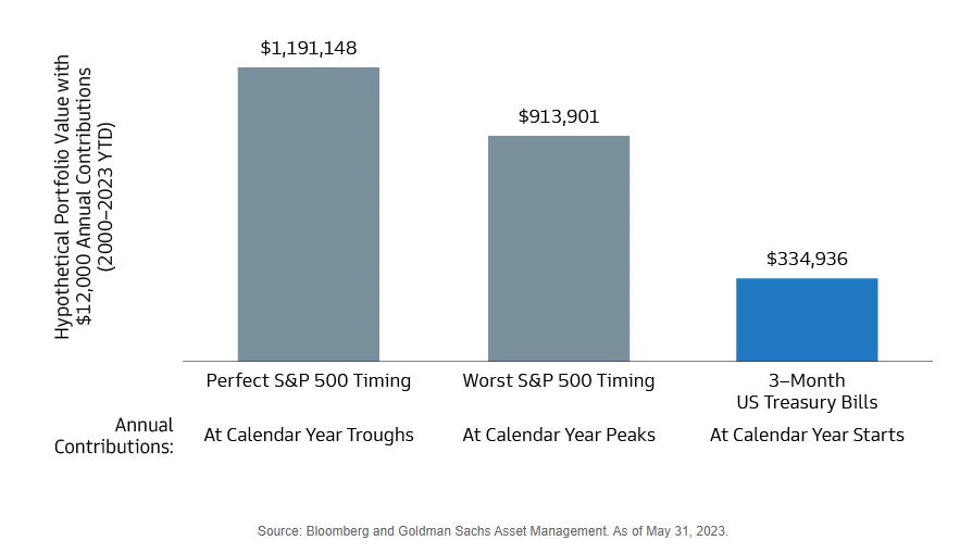
The difference in ending portfolio values between perfectly timed annual S&P 500 contributions and the worst-timed contributions is c$300k. But, the difference between the worst-timed contributions and holding cash is c$600k. That’s some pretty interesting data for old adage of ‘just stay invested’.
Therefore to wrap it up, investing at this point in the cycle requires enhanced discipline and to trust that the field you set is the right one. Making big bets to try and lure a wild Marnus Labuschagne to hit you through the covers in the hope he edges to third slip may work once or twice, but you can bet your house on him finding the middle and hitting you to the boundary many more times then you would like at some point in the future. Markets are by no means out of the woods and for me, having a few simple indicators to focus on helps cut through some of the shorter term noise and keep faith that the game is still very much on.
Onto Lord’s we go.

Leave a comment